
Website Speed Case Study: 94 on Mobile and 98 on Desktop Without Losing Quality
The short version
- This website speed case study follows a video production company we work with. Its website is full of large photographs, brand films and video loops, which is exactly the kind of site that usually loads slowly.
- After a focused week of speed work, the homepage scores 94 on mobile and 98 on desktop in Google PageSpeed Insights, and every main page scores 90 or more on mobile and 97 or more on desktop.
- The blog page went from 73 to 91 on mobile and from 79 to 100 on desktop, and the page no longer jumps about while it loads.
- Not a single photo or film was softened to get there. Every image is still pin sharp on phones, tablets and retina laptops.
Website speed is one of those things most business owners only notice when it goes wrong. A slow page loses visitors before they have seen a single word, and Google pays attention to that. The usual advice for speeding a site up is to shrink the images, but for a business that sells on the quality of its visual work, a blurry photo is worse than a slow one. This case study walks through the real Google PageSpeed results for one of our clients, a video production company, and shows how we improved its website speed without giving up any of the quality. We have kept the business name private, so the website itself is blurred out in the screenshots.
What is covered
Why website speed matters
When someone taps through to your website from Google, the first few seconds decide whether they stay. If the page is blank, slow to show its main image or jumps around as it loads, a good share of people simply go back and pick the next result. On a phone, over a patchy mobile signal, that happens even faster.
Google also measures this directly. Its Core Web Vitals look at how quickly the main content appears, how soon the page responds when someone taps it, and how much the layout moves while it loads. Google sets out what it looks for in its guide to Web Vitals. Good website speed will not lift a weak page to the top on its own, but when two businesses are close, the faster and steadier page has the edge. We cover the three measures in more detail in our guide to Core Web Vitals explained.
Key point: website speed affects two things at once. It changes how many visitors stay long enough to get in touch, and it feeds into how Google judges the page against your competitors.
Where the website started
The business makes brand films and video content for companies across the North East. We rebuilt its website earlier this year, and its whole purpose is to show off the work: showreels, video loops, case studies and hundreds of stills from shoots. Across the site there are 265 photographs, plus films on almost every page.
The client was clear from the start that every image and every film had to stay pin sharp. That ruled out the quick fix of compressing everything until it loads fast and looks soft.
Most of the site was already in good shape, but some pages were holding it back. The blog page was the clearest example when we tested it at the start of the week:
- Blog page on mobile: 73 out of 100
- Blog page on desktop: 79 out of 100
- Main image on screen on mobile: 4.2 seconds
- Layout shift: 0.40, well above Google’s 0.1 target, meaning the page visibly jumped about as it loaded
The individual blog articles scored 85 on mobile, and some of the larger photo galleries were sending far bigger files than any phone screen needed.
How to read a website speed test
The screenshots in this case study come from Google PageSpeed Insights, a free tool anyone can use to check how fast their own site loads. It tests a page twice, once as a mobile phone and once as a desktop computer, and gives each a performance score out of 100.
- Green: 90 to 100, a fast page
- Orange: 50 to 89, room for improvement
- Red: 0 to 49, a slow page that is likely costing you visitors
Under the score sit the measurements it is built from. The ones that matter most to a business owner are:
- Largest Contentful Paint: how long it takes for the main image or block of text to appear. Google’s target is 2.5 seconds or less.
- Cumulative Layout Shift: how much the page jumps around while it loads. Google’s target is 0.1 or less, and 0 is perfect.
- Total Blocking Time: how long the page is too busy to respond to a tap or click. Lower is better, and 0 milliseconds is ideal.
The mobile test is deliberately tough. It imitates a mid range phone on a slow 4G connection, so a mobile score in the 90s on a page full of photography and video is a strong result. Desktop scores are almost always higher.
The website speed results
We tested every main page again once the work was finished. Here is where the site stands now.
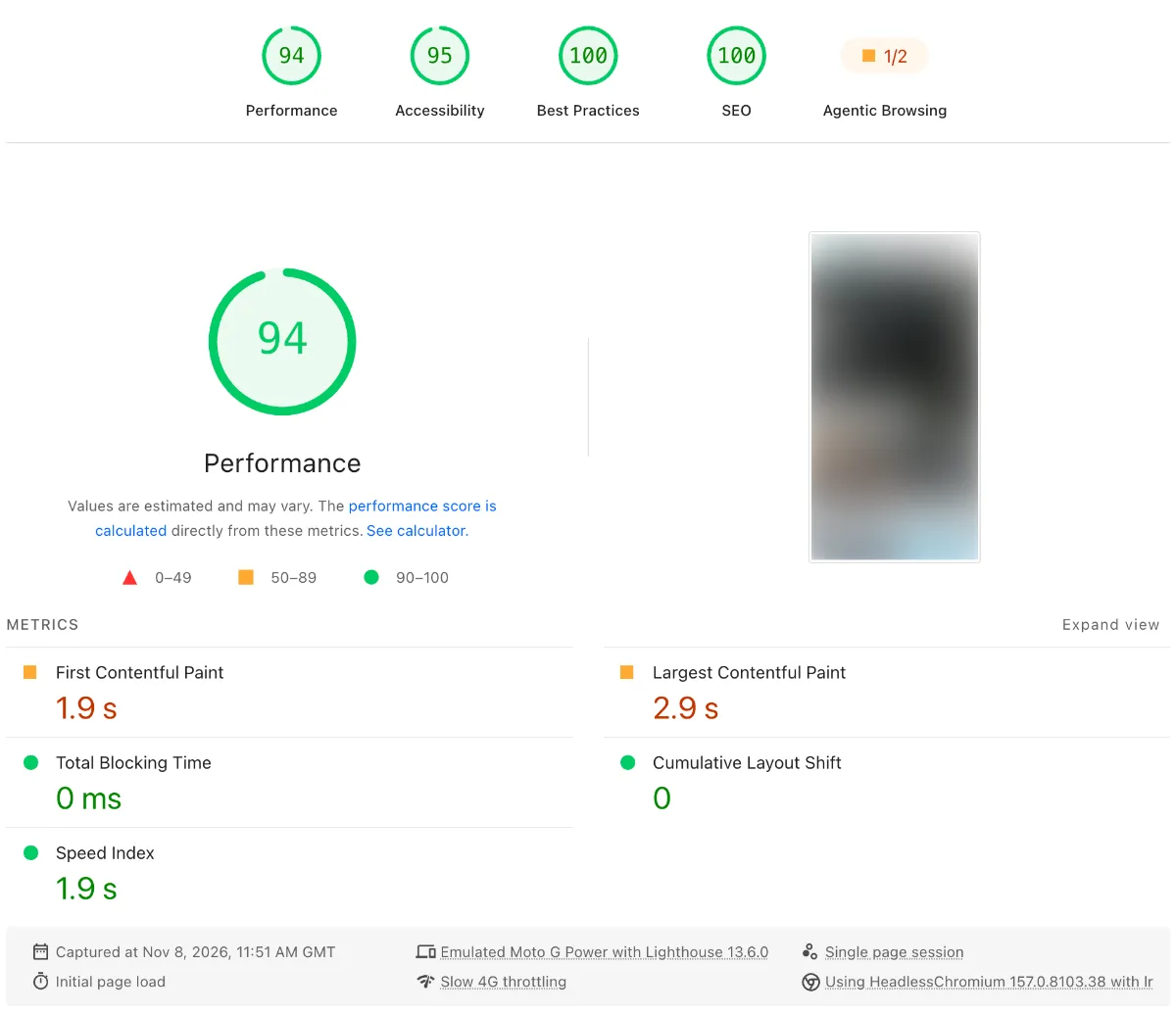
The homepage: 94 on mobile
The homepage is the heaviest page on the site, with a full width hero, a large photo grid and embedded films. On mobile it now scores 94, with zero blocking time and zero layout shift, so nothing moves once the page appears. The main image lands in 2.9 seconds on the test’s slow mobile connection, which is the one number we are still working to bring under Google’s 2.5 second target.
The homepage: 98 on desktop
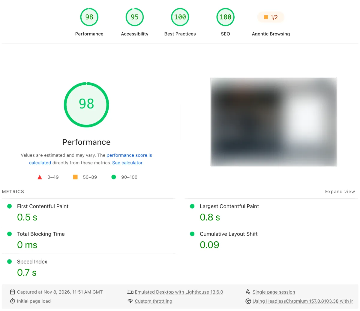
On desktop the same homepage scores 98. The main image appears in 0.8 seconds, the page is fully drawn in 0.7 seconds, and layout shift sits at 0.09, inside Google’s target. Accessibility scores 95, and best practices and SEO both score a full 100.
The blog: from 73 to 91 on mobile
The blog page saw the biggest change of the week:
- Mobile score: 73 to 91
- Desktop score: 79 to 100
- Main image on mobile: 4.2 seconds to 3.3 seconds, 0.9 seconds quicker
- Layout shift: 0.40 to 0, so the page now loads and settles in one go
- Blog articles on mobile: 85 to 91
Every page in the green
Across the site, every main page now scores 90 or more on mobile and 97 or more on desktop. The pricing, photography, corporate video and location pages all score 98 or 99 on mobile and 100 on desktop.
How fast is your website?
Our free SEO health check looks at your website speed, your Google rankings and your Google Business Profile, and shows you what is holding you back.
What improved the website speed
There was no single setting that fixed this. Good speed comes from a lot of small decisions, each one removing a little weight or a little waiting. These were the changes that made the biggest difference.
Every photo sized for the screen it is viewed on
The biggest win came from the photographs. A photo that looks crisp on a large retina laptop is far bigger than a phone needs. We checked every image on all 41 pages of the site, and the 265 photographs are now sent at the right size for each screen. The homepage photo grid alone is now 75 percent lighter.
The important part is that nothing was softened. Phones, tablets and retina laptops still receive the full resolution file their screen can show. Smaller screens simply download less, and that is where most of the speed came from.
Films and video loops left at full quality
For a video production company, the films are the product, so they were never going to be squeezed. The brand films and video loops play exactly as they did before, at full quality. The speed gains came from everything around them, so the video no longer has to compete with oversized images for the same connection.
A page that loads and settles in one go
The blog’s layout shift of 0.40 came from the page being assembled in stages, with sections dropping into place after the first view had appeared. We changed the blog so the articles are part of the page from the moment it starts loading. The result is a layout shift of 0, which means a visitor can start reading or tapping straight away without the page moving under their finger.
One consistent style across every article
The nine blog articles had been written at different times and had picked up slightly different heading styles along the way. We brought them all into one shared look, using the same single font family as the rest of the site and UK style dates. It looks more polished, and it also means the browser has fewer different styles to work through before it can draw the page.
Key point: the fastest websites are not the ones with the smallest images. They are the ones that send each visitor exactly what their screen needs, and nothing more.
What we are working on next
Speed work is never quite finished, and there is still room to go higher. The next steps are:
- Bringing every page into the high 90s on mobile, starting with the homepage.
- Bringing the main image on mobile comfortably under Google’s 2.5 second target on the slow connection test.
- Making the contact page settle as smoothly as the rest of the site while its enquiry form loads.
What this means for your website
Every website starts from a different place, but the same principles apply whether you run a trade business, a clinic or a creative studio.
Website speed should be built in, not bolted on
Plugins that promise to speed up a website can help, but they cannot fix a page that was built heavy in the first place. The best results come when website speed is planned into the design from the start. That is how we approach every web design project, and it is often the first thing we look at in a website redesign.
Images are usually the biggest win
On most small business websites we look at, oversized photos are the main reason pages are slow. Sizing them properly for each screen can transform load times without anyone noticing a drop in quality.
Always check the mobile score
Most of your visitors are on a phone, and the mobile score is the one that tends to show problems first. If your desktop score looks fine but mobile is orange or red, that is where your visitors are waiting.
Hosting and upkeep matter too
A fast build needs a fast home. Good website hosting and regular checks keep a site quick as new pages, photos and plugins are added over time. Our website maintenance checklist covers what to keep an eye on.
Want a faster website?
If your website feels slow, or you have never checked your website speed, we can test it with you, explain what the numbers mean and show you what it would take to get your pages into the green.
Start with our free SEO health check, book a free discovery call, or get in touch and we will take a look at it together. You can also see more of our results on our case studies page.

Michael James
Michael heads up NE1 Web Design & SEO in North Shields and has been building websites for more than twenty years.